You upload a photo, a few seconds pass, and a picture appears with hundreds of numbered zones that, once painted, reconstruct your image. What happened in between? In this article we open the hood on Color Memories and walk through the whole process in plain language — not a single formula — because understanding how it works also helps you choose better photos and difficulties.
The underlying problem: millions of colors, a hundred paint cans
A phone photo has millions of distinct colors: every pixel can differ from its neighbor. A paint-by-number picture, on the other hand, has a closed palette — in our case, somewhere between a few dozen and about a hundred colors depending on difficulty. The algorithm's first job is deciding which colors deserve a "can": finding the reduced palette that best represents that particular photo. A forest photo will spend many cans on greens; a portrait, on skin tones.
This step is technically called color quantization, and it has an important subtlety: it's not done by measuring colors the way a computer sees them (red-green-blue), but in a color space designed to mimic how the human eye perceives differences. Two greens that look far apart to a machine can be indistinguishable to you, and vice versa. Working "in human-eye units" makes sure the cans get spent where they're actually noticeable.
From loose pixels to paintable zones
With the palette decided, each pixel in the photo gets assigned to its closest matching color. The intermediate result is a "posterization": the photo with flattened colors. But that still isn't a paint by number — it's a mosaic of pixels, with stray specks everywhere (a shadow pixel in the middle of a cheek, three reflection pixels in an eye).
The second job is grouping: neighboring pixels of the same color merge into contiguous zones, and specks too small to paint with a finger get absorbed into whichever neighboring zone best hides them. There's a delicate balance here: absorbing too little leaves the picture full of zones impossible to tap; absorbing too much eats details that matter (the glint in an eye is tiny, but it's what brings a portrait to life!).
One sacred rule: one number, one zone
There's a property we take special care of: every numbered zone is a single continuous patch. It sounds obvious, but it's easy for an algorithm to produce "zones" split into two separate pieces (for example, the sky visible on both sides of a tree classified as the same zone). On paper that's fine; digitally it would mean tapping in one spot paints two separate patches at once, which breaks the feeling of control. That's why each separate patch gets its own number, even if it shares a color with another.
Numbers, outlines and the final canvas
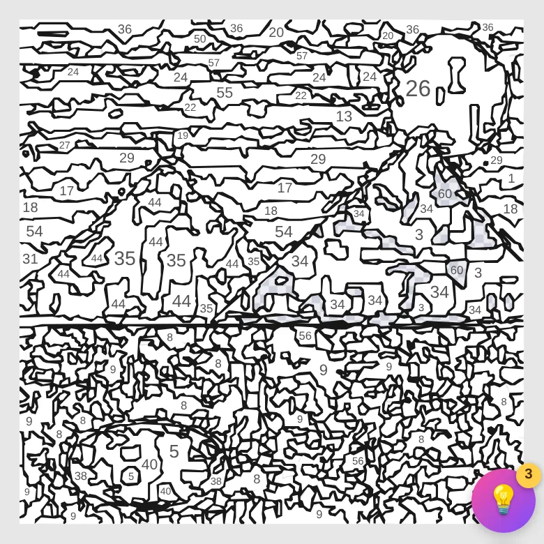
What's left is presentation: drawing the outline of each zone (the thin lines you see before painting), figuring out where to place each number so it fits inside its zone — tricky in small or elongated zones — and composing the final canvas. In Color Memories that canvas isn't a static image but a vector graphic (SVG): the zones are mathematical shapes, not pixels. That's what allows infinite zoom without anything pixelating, painting a zone with an exact tap, and keeping the picture lightweight even with 1,300 pieces.
The finish: multitone or flat colors
Painting a zone offers two philosophies. With flat colors, the zone fills with the can's color, uniform: the result looks like an illustration or a poster. With multitone — our default — the zone fills with the real average of that part of the photo, so two zones from the same "can" can have slightly different shades: the final result looks much closer to the original photo. The gameplay grid is the same; only the painted finish changes.
Why the result sometimes surprises you (for better or worse)
Understanding the process explains the typical successes and failures:
- Blurry or dimly lit photos fail because the algorithm can't find clear borders between colors: you get large, amorphous zones that don't outline the subject.
- Very detailed backgrounds (foliage, crowds) eat up the palette: the cans get spread across thousands of details, leaving fewer shades for the subject. Cropping the photo first helps enormously.
- Gradients (skies, sunsets) need lots of cans to look smooth — that's why they shine at higher difficulties.
- Contrast is your friend: a light subject on a dark background (or vice versa) produces sharp borders and an unpainted drawing that already "reads." It's the number-one criterion in our which photos work best guide.
What about my photo's privacy?
A reasonable question when uploading personal photos. Color Memories' design is deliberately conservative: your photo is used to generate the picture, and the original photo is saved only on your device — it's never stored on our servers nor included in cross-device sync. What syncs (if you have an account) is the generated picture and your progress. Full details are in the privacy policy.
See the process with my own photo →